Since I own a sign shop now, I wanted to take the opportunity to educate the readers of my tiny blog about this tricky medium. I see a lot, a
lot of bad signs daily so I wanted to discuss the good, the bad, the ugly and more in this three part series. Lets get started shall we?
What is a Sign?
"A sign is an entity which signifies another entity."--Wikipedia. A sign can be as small as a flyer or as large as a billboard. Regardless of its size, signs should always have (1) an intended target (2) a decided goal (3) a clear message.
Primary Goals of a Sign
Signs can inform. An informative sign can announce holiday hours, new management, a new location, a grand opening, basically anything you would like to tell another person.
Signs can label. Using a sign as a label is a pretty common occurrence since they label a store front, an entrance, an exit, ect.
Signs can solicit a response. We've all been traveling on the highway at one time or another and have seen the big "EXIT NOW" signs. These are they types of signs you'll be most likely to use, compelling your customers to call or visit or buy.
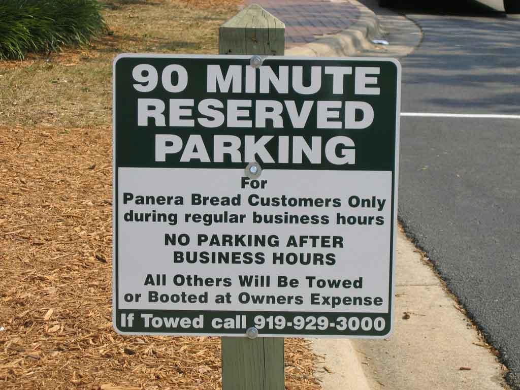
Diagram of a Good Sign
A good sign is composed of 3
good qualities. (1) Clear Title (2) Legible Instruction (3) Contact Information. Using the sign to the left as an example, lets go through the qualities one by one. A
clear title refers to the headline of a sign. The headline should always be the main point you want to communicate to the reader. You can never fully count on the fact that a person will read everything you have to say so get to the point and get there as fast as you can. Looking at the sign to the left, you can figure out the gist of the sign without having to read the whole thing: "reserved parking" for customers only. Read on a bit and you get to the
legible instruction. The sign tells you clearly when you may and may not park in this space. If you are not a customer and it is after business hours, you better get lost. Lastly, contact information is important. Never forget your contact information, especially if your sign is soliciting a response. Phone numbers are the most common and should be second biggest piece of info on the sign after the title.
Hallmarks of a Bad Sign
- Conflicting or distracting colors
- Illegible fonts
- No clear headline or title
- Too much information
- Too little information
- No contact information
- Confusing symbols or images
- Letters too small
- Poor arrangement
- Useless information or symbols (one of my biggest pet-peeves is when people start a sign with WOW! as an attention getter instead of getting to the point)
The next two installments will be about signs for advertisers and designers. Same bat time, same bat channel!