Monday, June 28, 2010

Signs 101: An Introduction to a Tricky Medium

Since I own a sign shop now, I wanted to take the opportunity to educate the readers of my tiny blog about this tricky medium. I see a lot, a lot of bad signs daily so I wanted to discuss the good, the bad, the ugly and more in this three part series. Lets get started shall we?

What is a Sign?
 "A sign is an entity which signifies another entity."--Wikipedia. A sign can be as small as a flyer or as large as a billboard. Regardless of its size, signs should always have (1) an intended target (2) a decided goal  (3) a clear message.

Primary Goals of a Sign
Signs can inform. An informative sign can announce holiday hours, new management, a new location, a grand opening, basically anything you would like to tell another person. Signs can label. Using a sign as a label is a pretty common occurrence since they label a store front, an entrance, an exit, ect. Signs can solicit a response. We've all been traveling on the highway at one time or another and have seen the big "EXIT NOW" signs. These are they types of signs you'll be most likely to use, compelling your customers to call or visit or buy.

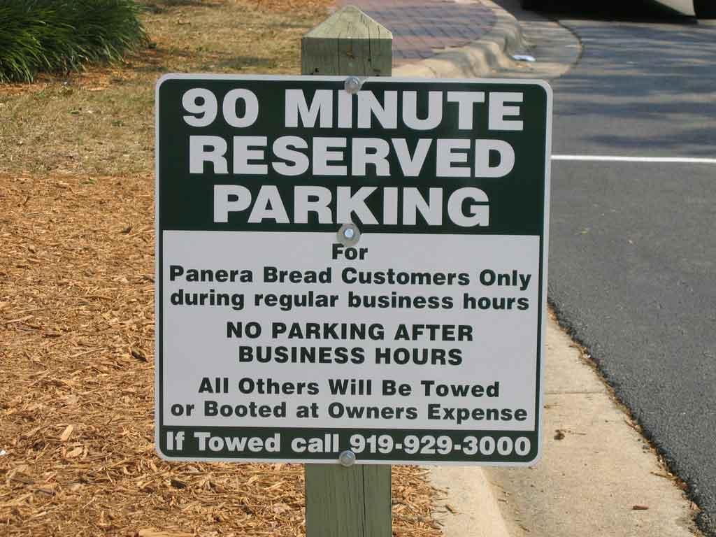
Diagram of a Good Sign
A good sign is composed of 3 good qualities. (1) Clear Title (2) Legible Instruction (3) Contact Information. Using the sign to the left as an example, lets go through the qualities one by one. A clear title refers to the headline of a sign. The headline should always be the main point you want to communicate to the reader. You can never fully count on the fact that a person will read everything you have to say so get to the point and get there as fast as you can. Looking at the sign to the left, you can figure out the gist of the sign without having to read the whole thing: "reserved parking" for customers only. Read on a bit and you get to the legible instruction. The sign tells you clearly when you may and may not park in this space. If you are not a customer and it is after business hours, you better get lost. Lastly, contact information is important. Never forget your contact information, especially if your sign is soliciting a response. Phone numbers are the most common and should be second biggest piece of info on the sign after the title.

Hallmarks of a Bad Sign
  • Conflicting or distracting colors
  • Illegible fonts
  • No clear headline or title
  • Too much information
  • Too little information
  • No contact information
  • Confusing symbols or images
  • Letters too small
  • Poor arrangement
  • Useless information or symbols (one of my biggest pet-peeves is when people start a sign with WOW! as an attention getter instead of getting to the point)
The next two installments will be about signs for advertisers and designers. Same bat time, same bat channel!

Tuesday, June 22, 2010

How to Use Craigslist Right, in My Opinion

My first foray into guerilla marketing started a few months ago when I picked up an awesome little book by Jay Conrad Levinson. I read a lot about his thoughts and practices but never actually put his good advice to use until I started my sign shop. Mr. Levinson is a big cheerleader for classified ads and acknowledges the growing popularity of online classified ads as a money saving alternative. By far, Craigslist is the most popular online classified site, but navigating the spam laden beast to get any true value from it takes some doing. This post is to share some of what I've experienced in hopes of saving you some time and effort.

Intro to Craigslist
"Craigslist is a centralized network of online communities, featuring free online classified advertisements – with sections devoted to jobs, housing, personals, for sale, services, community, gigs, résumés, and discussion forums."--Wikipedia
Its very similar to the Sunday classifieds that run in your local paper, only there is no cost for most listings and the viewer ship of craigslist pages is in the hundreds of thousands--even millions in some cases. Check out the Factsheet for more about Craigslist.org.

Writing Your Ad
Classified ads are meant to be brief by nature so get to the point. If you are a dog groomer, make "dog groomer" your post title not something like "Time to Love Fido Back". When looking through listings, people scan for pre-determined keywords in their brain. Make your title 7 words or less and frank.

The first line of your ad is where you engage. If some one is reading your ad, that means they clicked the link. If they clicked the link, you can be fairly sure that they are interested in what you're selling. Now you can talk to them:
  • Briefly explain your business or service
  • Pick three or fewer points to highlight (i.e. no minimum order, same day delivery, etc.)
  • Provide contact information and business hours
  • Make a call to action (i.e. call now for a free quote)
Choosing Your Category
Craigslist has 11 main categories. The ones you will be most likely to post in are "service offered" and "for sale." You have to choose your sub-categories wisely as Craigslist reminds its users to "Please post to a single geographic area and category only -- cross-posting to multiple cities or categories is not allowed." The categories are pretty self explanatory, but you can always use Craigslist Help if you have questions. However, the easiest way to determine if your ad belongs is to read some of the others in the category you're thinking about posting in. It will also help you to determine what makes a good ad and what makes a bad one.

Measuring Results
I post in 7 different categories on Craigslist. Since I've only been at this a month, I'm still in the process of collecting accurate measurements on which categories bring me the most real traffic (as opposed to SPAM). One of the most accurate ways to find out where you're ad is doing the most good is variation. I only post ads about banners in the "skilled trade services" category. Ads about coroplast yard signs are listed in "general", ect. When I check my messages I look at what the person is asking for. So far, my banner ad in "skilled trade services" is working the best. You can adapt this approach to fit your situation even if you don't have varying products to sell. If you offer a different incentive in each ad (i.e. free consultation, 5% first order, ect.) you can track the successfulness of your ad just as easily.

Beware... SPAM!
SPAM is still a big part of the internet and, unfortunately, a big part of Craigslist. While the site does take precautions to help cut down on fake posts and web bot solicitations of posters it does still happen. I get around 5-7 SPAM emails per post. The most common are people emailing me links to other sites where I can "post my item for sale" or scammers trying to get me to agree to bad money order transactions. I never click any link sent in a Craigslist email, it could be a Pandora's box. I also spot scammers with a few easy flags:
  1. Misspellings
  2. Poor grammar like the writer is not a native English speaker
  3. False greetings like "hello ma'am/sir"
  4. Short messages saying they are "interested in my item" but give no other detail or information
The good news is you won't get a lot of these messages. They normally only message you once and when you don't respond, they go looking for another patsy. I only post 3 ads a day once a week. That's 15-21 fake messages and most of them are caught by my junk mail folder before I even get them. For around every 5 fakes, I get 1real inquiry. That inquiry is worth it.

Making Your Winners Work
Now that you've written a great ad and measured the results from your posting schedule, you need to ramp it up. Right now I post once a week. Once I weed out less successful categories I can post more often in the categories that work for me. Be aware though, that a once a day post is the most you can do for a single ad, so have two or three versions written up. It will keep your message fresh and help cut down on redundancy on Craigslist.
Wednesday, June 16, 2010

Client Databases: Your Support Network

Its been a while since my last post. Starting a small business venture while juggling clients is hard work, so my blog has been on the back burner. I couldn't for the life of me think of an appropriate topic. It came to me today while doing some client follow ups--Client Database=Good.

Back in the good old days of paper and ink, a client database was nothing more than the big Rolodex on a businessman's desk. It held every name, phone number, address, and note about each contact that its owner would need to conduct business effectively.

Fast forward to 2010 and the age of the "2.0" everything. Most small business owners don't own a Rolodex, or even believe in their power. Quickbooks holds client info. That's just as good right? Microsoft Outlook keeps track of my contacts, what more do I need? Both very valid statements, now let me take the time to prove you wrong.

What's So Wrong with Quickbooks?
Short answer: nothing. Quickbooks is a great way to keep track of orders, invoicing, income and expenditures. It is accounting software for the everyman, and everywoman, in business for themselves. But its just that, accounting software. While it may keep track of basic contact information and orders, it is not set up to relate non-accounting information in a useful way. When you construct a client database, specifically for the purpose of housing client information, you have control over the way your information is displayed. Control is good. Example: You run a sign shop. You want to promote plastic yard signs as your monthly special with a direct mailing campaign and personal phone call to all clients who have purchased signs in the last year. Using Quickbooks, you can look up the orders of each business by their name only. With a client database, you can sort by date and type of purchase, then just print a list of names and contact info. The information is available to you electronically in both scenarios, but which uses less time?


Misplaced Expectations & Outlook
Outlook is awesome, but it can't do everything. Yes it makes managing contact information easy and because its a Microsoft product, things like mail merge are a breeze. But its functionality stops there. Outlook manages mail. Conversations. Not products. Not orders. Not your client relationships. A client database can hold more detailed information than an Outlook contact page--information that may come in handy. Example: You own an upscale full service beauty salon. You offer specials for holidays and clients' birthdays. One of the employees suggests a mother daughter manicure pedicure deal for the month of May, because of graduations. With a client database, you could gather and store information tailored to your marketing needs because it is constructed by you for your own use. In this situation, you could search your client list for Women >with daughters 17-18 and prepare a nice mailer explaining your offer. Alternatively, with Outlook as your contact manager, the best you could do is mail merge all the addresses on to address labels and direct mail everyone on your list.

The 5 Truths about Client Databases
The title of this post talks about a "support network." Your clients are your support network. They support your business. You should support them and a database will help you do that. Its all about After Care, a practice that isn't just for hospitals anymore.

  1. Not every database is a useful database. Databases that are poorly maintained, missing information, out of date and/or have too much or too little information, are all just a big waste of time.
  2. Planning and maintenance are a must. Before you start on your database adventure, sit down with a blank piece of paper and think. You need to decide (1) what the database will be used for and (2) who will use it. Plan out your fields of data and how you will collect them (i.e. will the clerk ask the customer, or will the customer be given a form, ect.). Create your database and set a schedule for updates, in addition to making changes as they occur. The scheduled review will allow you to identify problems or trends within your database, that you might not notice when popping in to make an address change.
  3. Databases can enhance relationships. Small businesses have the advantage of "face-to-face loyalty"--you see your customers regularly, you know their buying habits and may even be on a first name basis with them. You've built a relationship. Because of that relationship, any communication you have with them will not be seen as spam or unwanted solicitation (as long as you don't get crazy with it). So look them up once in a while and call them, or write them--handwritten letters are best--and say something like "Hey Sue, it's Margret over at the Tea Cup cafe. I wanted to send you some early birthday wishes and let you know about the great menu the restaurant will be having the weekend of your special day..."
  4. Databases can help you provide better service. A properly constructed database will give you the tools you need to understand your clients, their wants and needs. It can also help you identify habits so you can anticipate requests.
  5. One database may not be enough.  Databases with too much information are useless because you can never find what you need. If you run a very detail oriented business or have thousands of clients, you may need several databases that cross-reference each other for enhanced functionality.
I'm writing this on the verge of starting my own customer database. I'm sure going through that process will afford me some valuable information to share with all of you. I'm keeping my fingers crossed.

Thursday, May 27, 2010

Does "Like" Equate to Increased Sales?

Facebook is gaining popularity as an advertising/marketing medium. Lots of businesses big and small are creating corporate fan pages and groups. I, of course, have a Facebook account for personal use but not one for my freelancing business. Why? Because, while Facebook is totally awesome it doesn't work for everyone. I'll be working on a short post called "You might not need Facebook if..." but right now we're talking about the infamous "Like " button.

For those of you who may not be familiar with the way this whole thing works, aside from personal pages, people can create group pages and fan pages. It used to be that if you wanted to join a fan page you would click the "Become a Fan" button. Not anymore. If you want to join a fan page, you now click the "Like" button. When you "like" a page, you are added to the column of other people who "like" this particular thing--similar to being a fan, but with one major difference. This little switch enables Facebook to offer targeted advertising to corporations because they keep meticulous notes on everything each Facebooker "likes." Facebook then packages all the people that "like" something as a potential sales pool, but how many people buy just because they "like" something?

There are lots of other blogs with lots of theories about how to calculate ROI on Facebook. I'll list some links at the end, but this article is about a misconception that I keep running into: Like=Increased Sales.


4 of my friends "like" Wal-Mart
Most people shop at Wal-Mart because of convenience, or the perceived value, so it was no surprise to me that 4 of my Facebook friends had joined the store's page. At my last count 1,173,430 "like" Wal-Mart.  

We all know that more than a million people shop at Wal-Mart. I'm sure lots of them are not on Facebook for whatever reason but if Facebook has over 400 million active users shouldn't they have a share larger than .003? The explanation is simple, an Absence of Users--a company's popularity can never be fully represented by it's fan page. People may shop there but not join the page because of apathy, ignorance, or "whatever." I shop at Wal-Mart, there's one right up the street from my house, but am I on their fan page? Nope. Why? I'm one of the "whatever" people, I just didn't care.

I'm a Fan of World Market
I decided to "like" World Market because its a specialty store. They commonly post specials and sales as well as new products to their Facebook page. They aren't close to my house and I don't shop there unless I need something so their Facebook posts alert me to items/events I might not have otherwise known about. Do I always buy? No. But that's no different from the same risk you take with mailers and email newsletters--however, some people don't see it that way. False ROI--beware of micro marketers that give you a hard number for increase in sales based on your "likes." Without detailed tracking, you won't be able to tell the difference between fans that are making regular purchases not influenced by your Facebook effort and ones that truly represent an increase that couldn't have been possible without it.


Likers that Like to "Like"
Its hard to get a good estimate of actual "likes" because of something I call the Inflatable Pool--people will "like" something their friends "like" even if they have no real feeling about it one way or the other. These people inflate your fan lists making you think that you have more potential customers than you really do. They don't represent any sort of sale, let alone a sales increase. Keep in mind how easy it is to click "like." Its not the same as signing up for a membership or joining a loyalty club--there's paper work and occasionally a fee, so if they do it, they want it, and are interested enough in it to go the extra mile.

The bottom line? It's great if people "like" you but its important to know who your real customers are.

Additional Reading

Monday, May 3, 2010

Why Can't SoBe Get it Right?

Originally I had another blog post planned for today, then I read an article on Advertising Age about Chick Fil A and Popeye's and what they did right. That started the wheels turning and I was suddenly reminded of a company that has gotten it very, very wrong--in my opinion--a lot in recent memory SoBe, the Life Water people.

I remember SoBe from my time in high school. The drink company hit the shelves in the late 90's so it was still fairly new when I started drinking it. With its big glass bottles and natural ingredients it felt really 90's and always made me think of Sheryl Crow for some reason...maybe it was that whole free spirited "soak up the sun" attitude SoBe associated itself with. The iconic lizard was plastered all over jeeps and surf boards and to be "healthy hip" meant a steady supply of the stuff in your fridge at all times.

Then something happened. SoBe fell out of favor. Whether that has anything to do with the emergence of Glaceau and it's Vitamin Water brand around the same time remains a matter of opinion, but something caused the lizard and it's Life Water to loose its way.

The Super Bowl Ad
Since this is commentary, I can say what ever I want and I want to say "What were they thinking!?" I've posted the ad below. What do dancing "Thriller Lizards" and Naomi Campbell have to do with a health beverage?


Let's break this down as a lesson in a bad commercial. 1) Note the perils of using a celebrity spokes person. Any person in the ad game, who knows their stuff, will tell you that attaching your company's image to that of a star or starlet is one of the worst mistakes you can make. Its the equivalent to putting all your eggs in one basket. If their ship sinks, consider yourself caught in the undertow. 2) Pop culture does not stand alone. It would be safe to say that since music videos were invented, "Thriller" has been in the top 5 of the best videos of all time. Its a total cultural phenomenon that has managed to retain its popularity and relevance (at least to some extent) for decades. Grafting yourself into the famous dance sequence will NOT make YOU famous and will do less for your brand.  Things like Thriller became popular in the first place because they were unique, original and sometimes ground breaking but always the first of their kind done right. Never expect revolutionary results from re-hashed ideas. 3) Mascots are an identity, identities are unique. Both SoBe and Geico have lizard mascots. You don't need me to tell you which one is the more successful. The Geico Geko is a friendly employee in an insurance company--that's his identity. The SoBe lizards are well, props. They can be used and misused in any way that an advertising agency feels fit. A muddled mascot identity can lead to a muddled corporate identity.


The Super Bowl Ad Pt 2
Just another example of how a muddled identity can spawn some weird commercials. But while you watch this look closely for something that is missing.


Did you catch it? It was proper product placement. I think the product appeared around 7 times. A couple of "Mmmm, I'm drinking this beverage" shots but nothing about Life Water's benefits, flavors, why you should pick this over Vitamin Water or anything useful really. What should you take from this? TV commercials are expensive. Don't waste your time or your viewer's time. Get to the point and showcase your product's features and benifits. Animated lizards, ballerinas and monsters with aliens will not improve your bottom line. Don't believe me? Check out the comment thread on YouTube for this commercial.

Ashley Greene + 0 =???
Ok so obviously SoBe did not learn their lesson with Naomi Campbell and rounded up another starlet. This time the "angelic" Ashley Greene from Twilight. They painted her with body scale paint and put her naked on a beach to sell Life Water. The connection? She is "Wearing Zero" and the Life Water has zero calories. Clever right? It would be except for some obvious problems:
  • Zero calorie beverages are generally targeted toward women. 
  • Women don't normally buy a beverage from another woman who is trying to sell to them naked on a beach.
  • Men think Ashley Greene is hot. They will look at the SI spread and watch the commercials but will probably won't buy Life Water
  • Twilight, despite what everyone says, has a limited appeal and a hardcore fan base of young buyers. They are too young to watch the Mature rated commercials on YouTube.
  • SoBe has still not created a brand or identity for its product. They handed a bottle to a beauty with no clear plan.
The photography is glamorous and so high fashion--to bad they are selling a health drink and not swimsuits. Its just a clip. See more at SoBe.com

Monday, April 12, 2010

Beware of Misdirection

Last week we talked briefly about The Shocking Truth About Customers and how they will respond to visual cues more readily--almost instinctively--as opposed to informational cues or text. In that post I encouraged you to use pictures to communicate your message. Well today I want to talk about the correct way to use pictures and the in correct way to use pictures.

The Correct Way
A picture is worth a 1000 words. Everyone knows that pretty well. But selecting the right photo for the job can be tricky. Here are some tips on finding the right image for the job when preparing an ad:
  1. Decide if you are going the literal route or the creative route. For example, lets say you sold ketchup. If you went the literal route, you would use a picture of your bottle and a tomato as the focal point of your ad with copy that might read "Smith's ketchup. Real tomato flavor because it's made from real tomatoes". But if you're selling that same ketchup and wanted to go the creative route you may have a picture of a plate of french fries with copy that might read "Your fries are lonely." and an image of your logo at the bottom of the page. French fries and ketchup are related so its plausible that the audience will follow your line of thinking and appreciate the novelty of the ad.
  2. Determine the message of your ad. Your picture must enhance or contribute to your ad's message. If it is just a needless decoration, select a picture that will pull its own weight. Back to the ketchup. If you wanted to focus on the fact that Smith's ketchup is made from organic tomatoes, showing a smiling dirty farmer doesn't make as much sense as a picture of a beautiful tomato on the vine with a big "organic" sticker on it. Remember, customers may not read your copy, but that visual cue also gets your message across just the same.
  3. Consider change before compromise. If you have a big idea--a really, really big idea-- and are having trouble finding images to get that idea across, you can only do 1 of 2 things. 1) Pay photographers to stage and take the shots you need. 2)Change your idea. Its difficult enough to communicate to your audience as is, don't make things too had for yourself by reaching for an ad image that is impossible. Lets say Smith's ketchup has a new campaign "Fields so green they can be seen from space!". Obviously a picture from space would be expensive (and useless since you couldn't really see the tomato patch) so they should change their ad message. Sticking with the same "big picture feel" they could re-word their copy to say "Tomato Country" hand have several panoramic shots take of their green landscape. Putting the audience in the heart of the green fields will communicate their message of great organic ketchup better than a silly space photo.
The Incorrect Way: Visual Misdirection
We've all seen those Haute Fashion ads where no one really knows what's going on but we all just collectively nod and turn the page. Using Salvador Dali as a creative director might not be a good idea if you intend to market to the average Joe and Josephine. Here are some things to avoid:
  1. Reaching too far. If you decide to take the creative route for your ad message, make sure it still makes sense to the audience. Remember, they don't like to read so if your image will take a lot of copy to explain, you may want to re-think it. See this great example to the right. What does murder have to do with a postage meter machine? I don't know if I want to find out...
  2. Excessive shock factor. Half naked sexy women should be reserved for nightclub ads and adult themed items. A Photoshop composite photo of a nude woman sitting atop a pile of french fries drenched in ketchup doesn't make Smith's ketchup hot or edgy--just weird.
  3. Audience alienation. Pictures are a great way to combat the language barrier--if done correctly. When done incorrectly, a consumer who doesn't speak the native language will look at the ad and get confused (or in some cases offended) and by pass your product all together. The name of the game is wide appeal to your chosen audience. If you sell a general product in the US you have to assume that a decent number of Spanish or Creole speaking people will be viewing your ad. A confusing picture with a caption they can't understand will destroy any kind of sale. Take a look at the tobacco ad to below. This is an example of shock factor and well...a lot of things. But since the copy isn't in English I just don't know what to say about how they meant for this to be interpreted.
    For more reading on ads gone wrong check out: 25+ Ads That Are Just Not Right For Public Eyes

    Tuesday, April 6, 2010

    The Shocking Truth About Customers

    Not too long ago I wrote a post about Giving Your Customers Credit. I went on and on about how flexible they are and how willing they are to patronize your business given the right conditions. And all of that is true. But there is a fact, a single piece of knowledge about customers that you may not know. That is the subject of today's post.

    To put it succinctly: Customers Do Not Read.

    That might be confusing so let me explain with an anecdote. To make extra money, I work as a concessions cashier on the weekend. Its a pretty simple set up. I hand food through a window. On the counter, I arrange the napkin dispenser, drinking straw box and small trash container for the straw paper or other trash items. The trash container is clearly labeled in large letters but can you guess how many people actually put trash in the countertop receptacle? Only about 12%. What do the other 88% do? 75% walk a few steps to the big garbage cans next to the seating area. The other 13% litter. Granted there could be a lot of reasons why these numbers exist--like maybe 13% customers are just slobs--but for the sake of my post they make a great illustrative point.

    Lets say you have a great ad. One like this:
    But nobody gets it. You scratch your head and wonder why customers aren't beating down your door. Its because CUSTOMERS DON'T READ. Taking a closer look at this one pager, you'll notice that there is way too much copy. Today's consumer has an "instant" attitude when it comes to getting information. There are so many outlets vying for your customers attention that you will effectively take yourself out of the running if you make too much of a demand on their time. Going back to the trash can example, its not like I wrote a novel on the side of the container explaining what people should do when faced with a trash-related crisis. It simply said "Trash" but even that was too much copy for 88% of my customers. What's the lesson in all this? Use your words sparingly. You never know what will get across to your customers or if anything will resonate with them at all so don't waste your words and don't waste their time.

    Now you're thinking, "If I can't talk to them, how will I communicate at all?" Easy. Pictures. People respond to visual cues. That's why, 75% of my customers go to the big garbage can. That can doesn't have the word "trash" on the side, but because of what it is, when people see it they automatically link things together in their head. It might go something like this "Hmm, I have trash. Oh look, a trash can. I'm going to throw this trash in the trash can." Lets take another look at an ad.
    As creepy as this little girl is, this image makes a good point. You see the bread. You see the jam. You see the (scarily) hungry look on the girl's face. You get the message--Tasty. You want this because it tastes good. That's why Coke magazine ads and movie theater spots show that sweaty bottle. They don't need 2 paragraphs explaining how awesome they are, they appeal to your impulsive side because they know your brain acts on visual cues a lot faster than informational ones.

    There are a lot of things to take into consideration when planning your ads but the power of visual cues should not be over looked. Because this topic is so important I'll be posting a supplement about misdirection which should be a fun lesson. Hope you'll join me. Same bat time, same bat channel.