Showing posts with label Learning About Basics. Show all posts

Monday, June 28, 2010

Signs 101: An Introduction to a Tricky Medium

Since I own a sign shop now, I wanted to take the opportunity to educate the readers of my tiny blog about this tricky medium. I see a lot, a lot of bad signs daily so I wanted to discuss the good, the bad, the ugly and more in this three part series. Lets get started shall we?

What is a Sign?
 "A sign is an entity which signifies another entity."--Wikipedia. A sign can be as small as a flyer or as large as a billboard. Regardless of its size, signs should always have (1) an intended target (2) a decided goal  (3) a clear message.

Primary Goals of a Sign
Signs can inform. An informative sign can announce holiday hours, new management, a new location, a grand opening, basically anything you would like to tell another person. Signs can label. Using a sign as a label is a pretty common occurrence since they label a store front, an entrance, an exit, ect. Signs can solicit a response. We've all been traveling on the highway at one time or another and have seen the big "EXIT NOW" signs. These are they types of signs you'll be most likely to use, compelling your customers to call or visit or buy.

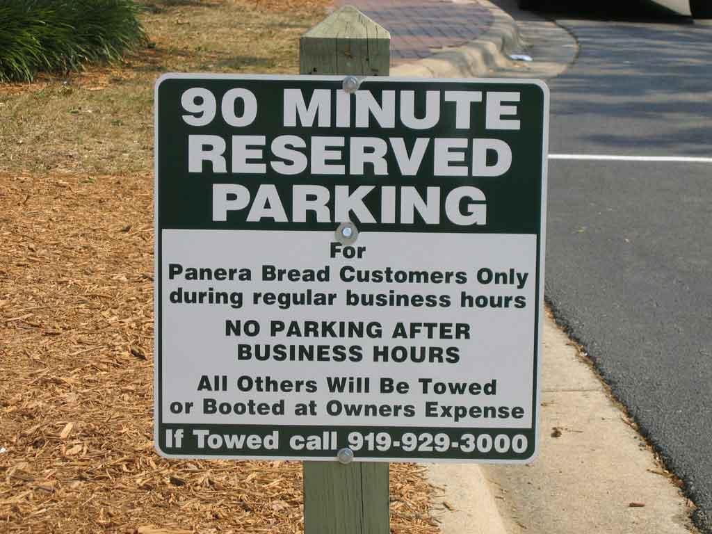
Diagram of a Good Sign
A good sign is composed of 3 good qualities. (1) Clear Title (2) Legible Instruction (3) Contact Information. Using the sign to the left as an example, lets go through the qualities one by one. A clear title refers to the headline of a sign. The headline should always be the main point you want to communicate to the reader. You can never fully count on the fact that a person will read everything you have to say so get to the point and get there as fast as you can. Looking at the sign to the left, you can figure out the gist of the sign without having to read the whole thing: "reserved parking" for customers only. Read on a bit and you get to the legible instruction. The sign tells you clearly when you may and may not park in this space. If you are not a customer and it is after business hours, you better get lost. Lastly, contact information is important. Never forget your contact information, especially if your sign is soliciting a response. Phone numbers are the most common and should be second biggest piece of info on the sign after the title.

Hallmarks of a Bad Sign
  • Conflicting or distracting colors
  • Illegible fonts
  • No clear headline or title
  • Too much information
  • Too little information
  • No contact information
  • Confusing symbols or images
  • Letters too small
  • Poor arrangement
  • Useless information or symbols (one of my biggest pet-peeves is when people start a sign with WOW! as an attention getter instead of getting to the point)
The next two installments will be about signs for advertisers and designers. Same bat time, same bat channel!

Tuesday, April 6, 2010

The Shocking Truth About Customers

Not too long ago I wrote a post about Giving Your Customers Credit. I went on and on about how flexible they are and how willing they are to patronize your business given the right conditions. And all of that is true. But there is a fact, a single piece of knowledge about customers that you may not know. That is the subject of today's post.

To put it succinctly: Customers Do Not Read.

That might be confusing so let me explain with an anecdote. To make extra money, I work as a concessions cashier on the weekend. Its a pretty simple set up. I hand food through a window. On the counter, I arrange the napkin dispenser, drinking straw box and small trash container for the straw paper or other trash items. The trash container is clearly labeled in large letters but can you guess how many people actually put trash in the countertop receptacle? Only about 12%. What do the other 88% do? 75% walk a few steps to the big garbage cans next to the seating area. The other 13% litter. Granted there could be a lot of reasons why these numbers exist--like maybe 13% customers are just slobs--but for the sake of my post they make a great illustrative point.

Lets say you have a great ad. One like this:
But nobody gets it. You scratch your head and wonder why customers aren't beating down your door. Its because CUSTOMERS DON'T READ. Taking a closer look at this one pager, you'll notice that there is way too much copy. Today's consumer has an "instant" attitude when it comes to getting information. There are so many outlets vying for your customers attention that you will effectively take yourself out of the running if you make too much of a demand on their time. Going back to the trash can example, its not like I wrote a novel on the side of the container explaining what people should do when faced with a trash-related crisis. It simply said "Trash" but even that was too much copy for 88% of my customers. What's the lesson in all this? Use your words sparingly. You never know what will get across to your customers or if anything will resonate with them at all so don't waste your words and don't waste their time.

Now you're thinking, "If I can't talk to them, how will I communicate at all?" Easy. Pictures. People respond to visual cues. That's why, 75% of my customers go to the big garbage can. That can doesn't have the word "trash" on the side, but because of what it is, when people see it they automatically link things together in their head. It might go something like this "Hmm, I have trash. Oh look, a trash can. I'm going to throw this trash in the trash can." Lets take another look at an ad.
As creepy as this little girl is, this image makes a good point. You see the bread. You see the jam. You see the (scarily) hungry look on the girl's face. You get the message--Tasty. You want this because it tastes good. That's why Coke magazine ads and movie theater spots show that sweaty bottle. They don't need 2 paragraphs explaining how awesome they are, they appeal to your impulsive side because they know your brain acts on visual cues a lot faster than informational ones.

There are a lot of things to take into consideration when planning your ads but the power of visual cues should not be over looked. Because this topic is so important I'll be posting a supplement about misdirection which should be a fun lesson. Hope you'll join me. Same bat time, same bat channel.

Friday, March 12, 2010

Cost Versus Value

I've been working with a client for a couple months on a print project. Assembling a book for sale is a big deal--especially when you choose to self publish. There are a lot of options out there that will offer new authors on a budget a helping hand, but my guy decided to go to a local print shop. Fair enough, choosing someone local gives you more control over the project. A print agent you can talk to and get real time advice from is an excellent choice for the first time self publisher who has no experience with book assembly. However, the subject of this post is not about the pros and cons of online versus local self publishing (although it might be an interesting topic to entertain at a later date) its about the dynamics of Cost and Value.

Low Cost=Low Value?
We've all heard the old adage "You get what you pay for." I agree. For instance, the offerings at Dollar Tree stores across the nation have expanded drastically in the recent years. Shelves that used to be filled with ceramic knic-knacks and cheap fake flowers now hold some really useful things, like umbrellas when the rain catches you off guard. When you buy an umbrella for a dollar, you don't expect it to be high quality, you don't expect it to last, you just expect it to be a "momentary item"--good for a few uses and completely disposable. After all, you got your money's worth.

Let's go back to my client. He chose a local print shop because of their price--their cheap price. The product he received from that shop looked, well, cheap and he was dissatisfied. In hoping to save money on the production process, my client has actually cost himself more in the long run--he now has to pay to have the book printed over again, and he's stuck with money invested a pile of product he's too displeased with to sell.  When making decisions about your product, or image, or business, remember that it should never be considered a "momentary item." Invest the time and money in yourself and your venture knowing that the value you receive in return makes it worthwhile.

High Cost=High Value?
Times are tight for everyone, and people in my line of work are feeling the crunch just as much as anyone else. Businesses usually cut marketing,and design by extension, to save money in their budgets. There are a million reasons why you shouldn't, and only one reason I can think of that you should--Cost>Value.

There's a particular clothing store that specializes in young female 20-somethings. I really liked their clothes. Yep, past tense. The price tags prohibited me from buying most things, but it was just my luck to catch a sale. I'd purchased a short sleeved casual jacket to dress up my sleeveless tops when meeting clients. I was able to get three wears out of it before the buttons, the nice buttons, came off in the wash--all of them. Granted, they are just buttons. I could go to any fabric store and pick up some plain replacements, but its the principle of the matter. I paid extra for that jacket perceiving it to be of higher quality than a Wal-Mart knock off. I was under the impression that I was making an investment and that the jacket would last until I had gotten my money's worth--the value equaled the cost. It didn't. I learned that just because something is expensive, that doesn't make it better; a very different lesson from the above paragraph but one to be taken to heart.

When examining your efforts, production, marketing, ect, be sure to evaluate what you're actually getting. Track where your business is coming from to make sure you aren't wasting marketing dollars. Shop around for manufactures to compare production costs. Re-evaluate your relationships with other businesses to make sure any partnerships really are mutually benificial. The list is endless. Just make sure that your cost doesn't out weight your value because in the end, you'll end up passing that cost along to customers and they may not be so willing to pay.

Wednesday, March 10, 2010

Lessons in the Life of a Business Card

I've been struggling for a long time to create a personal brand. You'd think I'd sit down and take the time to figure out how I would want to represent myself and the image I want to portray. And I have. The only thing is, I've been at this for a few years now, and I'm not the same person I was when I started. I look back at some of those designs now and am so glad I trashed them.

It all started with Japan. I wouldn't describe myself as an Asian Addict, but I've always held that country in high esteem and my early designs reflect that. As I describe my brief journey to the card I'm using now, please remember NOT to do any of these things and take it all in as a lesson of what to avoid.

Sanada Kyuu
Say that name. Its pronounced Sah-Nah-Dah Kee-you. Does that bring anything to mind? No? Exactly my point. That name doesn't mean anything. It doesn't tell you what I'm about, what I do, or who I am. Its not my first name, my last name or my middle name. Its not an animal, vegetable or mineral. Plain and simple it was a bad idea for a brand. Lesson 1: If you're going to brand yourself, pick a name that is relevant and makes sense.(side note: Sanada is the last name of a famous Japanese historical figure. Kyuu is the word for "ten"...it still doesn't make sense does it?)

Fresh
This was at the beginning of my foray into grunge. My business card was all black with white writing on it and a piece of sushi as the logo/icon. What? Exactly. I'm not a sushi chef. I don't own or work at a restaurant. I do eat sushi but that isn't something a potential client cares about. I couldn't tell you why I thought it was a good idea, I'm just glad I realized it in time. Lesson 2: Don't be misleading, intentionally or unintentionally.

Kitsune Creative
I was going through another phase, but this time I was into abstract looking images. At the same time I was doing some research for a series of fictional stories I was working on. The combination of those two things was, well, unfortunate. During my research, I found out that the etymology of the word "Kitsune", which means fox in Japanese, apparently came from an ancient Japanese folklore story. I immediately thought "fox, huh. Clever as a fox....great!" Obviously, I'd forgotten that I live in America and that the average person wouldn't speak Japanese at all let alone know anything about ancient folklore stories. Lesson 3: If you have to explain it, you may need to rethink it.

The Ox
This pretty much brings us up to present day. I've always been incredibly proud of the fact I was born in the Year of the Ox, I mean we have some pretty great attributes. I thought I should brand myself with something that was a part of me, so I began working on an icon/logo for myself. This big orange giant was my first attempt. Its a bit abstract, but I liked it. I used it for a while with a lukewarm reception. I thought "these people just don't get it" and chalked it up to their "lack of cool"--that was until a friend of mine saw it and said bluntly "what is that? It looks like a blob." Wow. Lesson 4: Your image conveys a message. If they don't get the image, they wont get the message.

So I moved on to the next ox in my life. I'd been creating a Kamon (Japanese style crest/icon) for a friend of mine to use on his business card and thought that an ox kamon would be perfect for me. Again I had the bright idea to combine elements of my two signs into one icon. That's how the "Ox under Moon" came about (I'm a Cancer, our governing planet is the moon). Not bad. But still not the modern bold statement I was looking for, plus it didn't test well. Lesson 5: Test. Test. Test. Try it out on a few people before making a big debut.

I hope my follies in business card design helped some of you out there. If you're interested in seeing the current card I'm using now, read my up coming post Design Log 1: 639. And if you have a minute, check out some of my business card designs on Zazzle. I'm always open to feed back. Remember: test, test, test! For additional reading, check out this blog post: The Basics of Business Card Design
Thursday, March 4, 2010

Creative Briefs

It took me a few days to get back in a posting mood. I've been working and working on getting part 2 of the "Lifestyle" post ready but its still forming and not ready for its debut. With nothing but side projects going on I wasn't sure what to post about today, then I thought about my totally awesome friend Dan Volkens. Dan is a web designer by profession but we met through his blog because we both have a love of all things Volkswagen.

I was working away on a web re-design for one of my freelance clients and had hit a wall. I drew sketch after sketch, looked at a bunch of examples, tried a few things and still wasn't happy. After a few weeks of spinning my wheels and getting nowhere I thought "I should really get some help on this." Luckily, I remembered Dan. He was nice enough to take the time to help me out by pointing me to resources I could actually use.

Although there are a lot of things I could talk about because I learned so much, I'll focus on one thing at a time. Today is the most important thing I took away from Dan's advice:

Do a Creative Brief. Silly me, I'd forgotten all about this. When I proposed a re-design to my client as a part of their marketing effort, I never thought I would be doing it. I was excited initially to be able to have so much control over the project and started searching the web for other websites that looked cool. I foolishly assumed I could take all the best parts from other websites, mash them together and come out on top with the best site on the web. FAIL. The more I tried to imitate other sites the more I hated the end result. I started to think that I was missing something...but what?? Duh. I was missing what the site was supposed to be all about. I hadn't sat down and fleshed out what I wanted to accomplish beyond just having a trendy looking site. Take my advice and don't skip this step for any creative project, web or otherwise. Here are 4 simple questions to get you on the right track:
  1. What am I trying to accomplish? (i.e. to inform, to entertain, to persuade)
  2. What is my message? What do I want people to know?
  3. Who am I talking too?
  4. How will I communicate my message?
I concluded that 1.) I'm trying to inform people with the website. 2.) I want people to know about the nightly specials at this night club. I want them to know that the club is also for rent for special events. I want them to know where the night club is. 3.) I'm talking to Tallahassee college students who like to go to dance clubs 4.) I will communicate my message online with a website that lists the specials, has a calendar of upcoming events, has a form for requesting space rental, has "share this" options, and has Google map links for directions.

Now that I know what my goal for the site is I can now focus on the design elements that will make the site function the way I want it to but that's a post for another day :) For now, if you want to learn more about Creative Briefs, read this article on Graphic Define. Its great!